Did you know that all living creatures need color in order to survive” Or that all human beings are affected by color, even if they’re not consciously aware of it” Color i s a sensory perception that evokes a response on a cellular level. Color is also a language that is universally understood by all humans, regardless of their country of origin. This month we’ll explore how color affects humans and why designers should be cognizant of this when specifying color for their environments.

Hue Knew”
Last month we discussed how the eye allows color to be seen by humans. My color mentor, Mr. Frank Mahnke, pointed out to me that I missed two key points in my article. The first is, in his estimation, the definition of color that is the most important for designers: “Color is a sensory perception, and as all sensory perceptions its effects are symbolic, associative, synesthetic, and emotional in context.”
Mr. Mahnke also called me to task for missing one important piece of information in my description: how color is perceived by humans. I described how the eye works, but I didn’t fully explain that the perception of color is only in the brain. To quote Mr. Mahnke: “Then the cognitive mechanism is activated of how we respond to color in its associative, emotional, and personal content.”
I agreed to write these articles so I could “spread the word” about how color affects us. Unfortunately, I don’t believe that most designers are taught this in design school. When I was in school, the focus was on how well we adhered to our design objective, how unique the design was, and how well coordinated the finishes were. How the colors and / or design would affect the users of the space was rarely discussed. For example, we all knew that young children’s rooms should be decorated in primary colors, because that is how things were done. So almost everyone utilized primary colors when an assigned project involved designing a space for children. If the space is a playroom, this may be an appropriate approach; if it is a bedroom, however, it may not be, as it could be too stimulating to the youngster when she is trying to go to sleep.

Techno Color
Have you ever walked into a space and felt totally relaxed and calm” Or, conversely, did you feel agitated and tense” Were you unable to identify why you felt that way” When you left the space, did the feeling go away” If so, it could be that you were subconsciously reacting to the color in the space.
There have been numerous studies that have cataloged human reaction to color. A document dating to 1500 BC has been found that describes how color was utilized to diagnose and treat ailments. Hippocrates (460–377 BC), Celsus (first century AD), Galen (AD 129–199) and Avicenna (AD 980–1037) utilized color for diagnosis and treatment. In fact, Avicenna studied color at length and declared that blue light slowed the movement of the blood and red light stimulated it (Mahnke 1996, p. 32).
In his book Color, Environment, and Human Response, Mr. Mahnke summarizes the findings of no fewer than 14 modern color researchers. Some did trials utilizing colored light, while others conducted experiments in rooms or chambers that were a particular hue. Though some of the findings differed in terms of how subjects reacted to a specific color, all documented some type of physiological change in the participants when they were subjected to the study tool. Mahnke summarizes Heinrich Frieling’s results of an investigation with colored light (Mahnke 1996, p. 40):
– Red stimulates; it is comparable to a sympathomimetic stimulus.
– Yellow is tensing but releases at the same time, and it raises motor activity.
– Violet-blue (and blue) increases inner reactivation and leads to calm, and the ability to concentrate.
– Green has an effect similar to a light stimulus that balances heterogeneous tendencies.
While these findings are interesting and significant, it is important to note that rarely is a space designed in only one color with the same hue and intensity throughout. Therefore, these findings should be used as guidelines, not as iron-clad rules.

Psych-edelic Colors
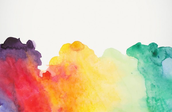
If humans are affected by color, do they also have similar associations to different colors” It appears that they do. During my research I read numerous articles about color psychology, many of which noted certain attributes assigned to specific colors. Here is a listing of the most common positive and negative descriptors that I encountered:
- Red: Passion, heat, love, excitement, danger, blood, violence, aggressiveness.
- Orange: Playfulness, warmth, vibrancy, balance, demanding of attention.
- Yellow: Happiness, joy, warmth, sunshine, cheerfulness, luminosity, dishonesty, cowardice.
- Green: Nature, tranquility, growth, abundance, environment, fertility, renewal, spring, envy, inexperience. (Green is the most restful color to the human eye.)
- Blue: Peace, tranquility, calm, truth, dignity, power, loyalty, melancholy, cold, depression.
- Purple/Violet: Wealth, royalty, spirituality, nobility, transition, cruelty.
- Black: Power, sexuality, sophistication, elegance, mystery, death, rebellion, hatred, sadness, mourning.
- White: Purity, cleanliness, simplicity, lightness, innocence, virginity, emptiness, sterility.
Keep in mind that while there appears to be universal agreement on how a particular color is perceived, that is not 100% accurate. I recently had a physician hire me to develop a color palette for his home. During our consultation, he told me that he did not want any green in his palette. He said he saw too much of it on a daily basis at the hospital and didn’t want it in his home. Even though green is considered tranquil and relaxing, it had the opposite effect on him. For this reason, knowledge of common color associations should be utilized as a guideline by designers, not as a standard recipe to “solve” a design problem.
I hope that I’ve been able to convince you that color plays an important part in the lives of all humans. Without color we would have no variety, no beauty, and no uniqueness. What a boring world that would be!

Bibliography
Mahnke, Frank. Color, Environment, & Human Response. New York City: John Wiley, 1996.
Demers, Owen. “The Psychology of Colors.” www.informit.com August 13, 2001.
Johnson, David. “Psychology of Color.” www.infoplease.com 2006.
“Color Psychology.” www.pantone.com
“How Color Affects Us.” www.colormatters.com
Resources

